Using a number of desktop publishing skills, I recreated a restaurant menu. I used Illicit as my restaurant’s theme.

Using a number of desktop publishing skills, I recreated a restaurant menu. I used Illicit as my restaurant’s theme.


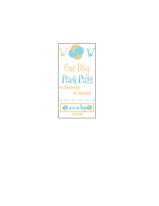


I was consistent with type, color, and format throughout the whole product. It tied together the waterpark.

I choose Helen Keller for my inspirational person. I put braille behind Helen Keller to remind the reader of her disability.


I created this comic book using many graphics. I used the same graphics consistently and rotated them.

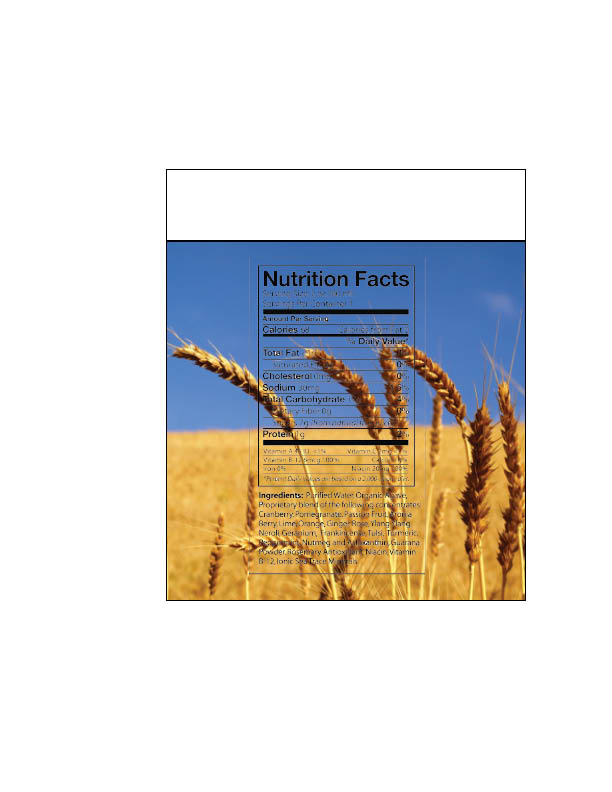
My group and I redesigned a granola bar box. We tried to make the design better than the original.

I used a catchy saying to appeal to customers. I also used graphics to enhance the design.

I used a fun font to appeal to children. I also provided visual examples of the candy.

When making this campaign poster i used the color white, red, and blue to create consistency. I also used thick, bold font to capture the reader’s attention.

I made an invitation for a Bar Mitzvah. I used candles and a bow tie to contrast with the overall theme.
I made a greeting card for someone’s birthday. I used lines for alignment.

